Why Game Providers Focus on Mobile-First Experiences
A decade ago, most online games were built for a large screen and then squeezed onto a phone as an afterthought. That order has completely flipped.
Today the phone is where a game is designed, tested, and launched first, with the desktop version trailing behind. This is not a small tweak to a workflow — it reflects a deep change in where players actually are, how they behave, and what they expect from a few free minutes of their attention.
The Numbers That Forced the Shift
Before getting into design philosophy, it helps to anchor the conversation in how usage actually broke down as the market matured, because the design choices only make sense once you see the audience that drove them.
The snapshot below traces how player attention moved from the desk to the hand across a single decade, and it shows why studios eventually had no real choice but to follow that attention wherever it went.
| Period | Where players were | What studios did |
| Early 2010s | Mostly desktop | Built for big screens, ported down |
| Mid 2010s | Split between both | Adopted responsive design |
| Late 2010s | Mostly mobile | Treated the phone as the main field |
| 2020s | Overwhelmingly mobile | Designed for the phone first |
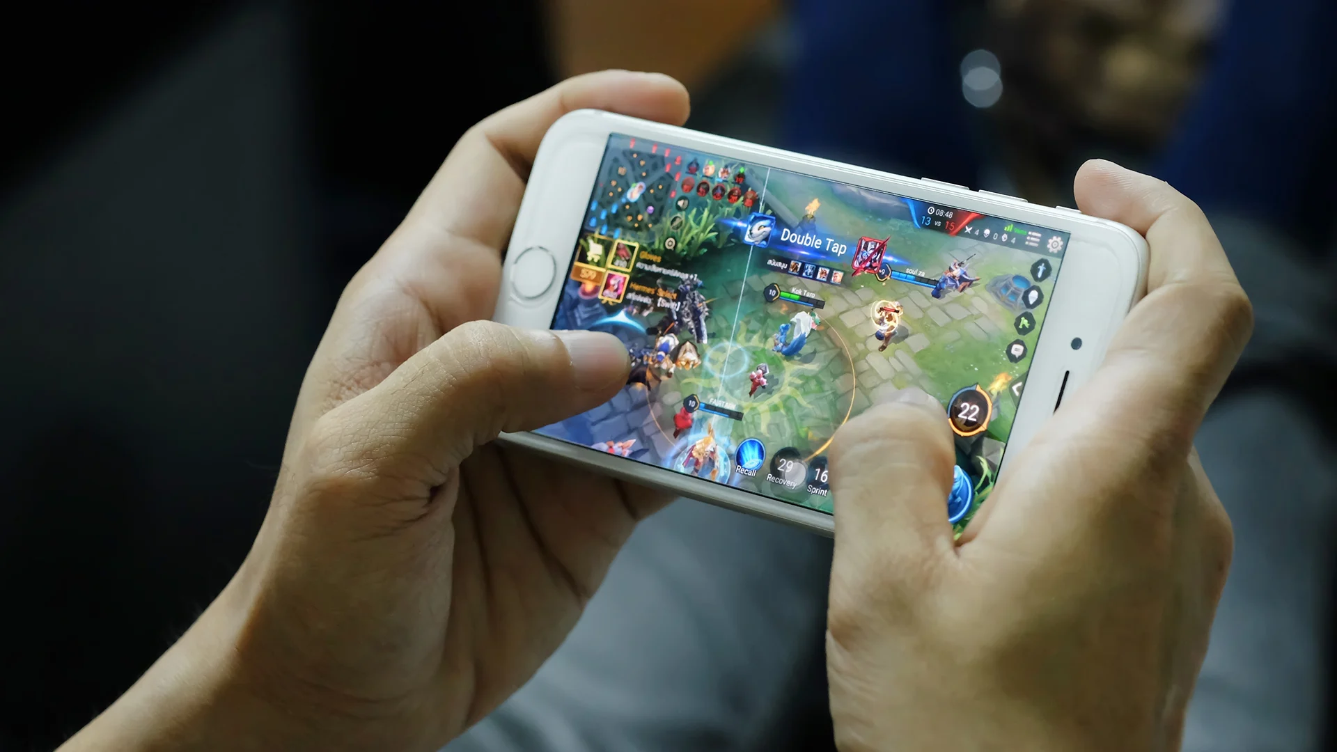
The Screen Where Players Already Live
The simplest reason for the shift is also the most powerful one to grasp. The majority of players now spend their time on phones rather than computers, and they reach for those phones in scattered moments throughout the day — on a commute, in a waiting room, on the sofa during an ad break, or lying in bed before sleep.
Each of those moments is short, unplanned, and easily interrupted, which turns out to change almost everything about how a game should be built.
A desktop session is a planned event that a person deliberately sits down to begin and tends to give real time to. A phone session, by contrast, happens whenever there are a few free minutes and then ends just as abruptly when the bus arrives or the kettle boils.
Studios followed their audience to the device that audience never puts down, because designing for anything else increasingly means designing for a shrinking crowd that logs in less often and stays for shorter and shorter stretches each time.
Gambling Led the Way on Small Screens
Few sectors pushed mobile-first design harder than online gambling, where every extra second of loading or any clumsy button can directly cost a wager.
A well-known betting operator such as vulkanbet demonstrates how far this thinking has gone — the entire experience is shaped around a thumb on a small screen, with slots that load in moments, live tables that stream cleanly over a mobile connection, sports markets that refresh on their own, and casino bonuses that can be claimed in a single tap while a player is standing in a queue.
Because operators compete so fiercely for engaged players, and because a frustrated player leaves within seconds, they came to treat mobile speed and smoothness as a matter of survival rather than a pleasant extra.
What Mobile-First Actually Means in Practice?
Mobile-first is far more than shrinking a layout to fit a smaller screen, though that is how it is often misunderstood. It is a set of decisions made at the very start of a project, long before the artwork or animation is finished, and those early choices quietly shape everything that follows them.
A team that truly commits to it treats thumbs, impatience, and tiny displays as the normal case rather than an awkward exception.
The habits below are what separate a genuine mobile-first studio from one that simply bolts a phone version onto a desktop product after the fact:
- Controls are designed for thumbs, with buttons placed where fingers naturally rest rather than where a mouse would click.
- Loading is ruthlessly optimized, because a phone on a cellular connection carries far less built-in patience than a wired desktop.
- Screens stay clean and uncluttered, since a small display punishes any element that does not clearly earn its place.
- Sessions are built to be paused and resumed, matching how people actually use phones in short, interrupted bursts.
Where Mobile-First Goes Next?
The trend shows no sign of slowing, and the next chapter is about depth rather than direction. Studios are building richer experiences that still respect the limits of a small screen and an unreliable signal, leaning on smarter streaming, lighter graphics engines, and interfaces that adapt to how each person holds their device.
The phone won this contest some time ago. The real work ahead is making the games on it feel every bit as complete and satisfying as anything that once demanded a desk and a big monitor.